

I was the sole Senior Product designer during my time in Memories. I worked on 5 products simultaneously across mobile and desktop. My main roles were to do research, conduct workshops, strategise with stakeholders, collaborate with marketing team with releases, collaborate with digital design team with business collaterals, design and test.
I helped design 2 new platforms for the company, improve on the existing platform and app, redesign the whole landing page for their main products and rebrand a newly acquired platform. For this case study, I shall be concentrating on the main Memories platform.
Memories was looking to improve the user experience of the Memories platform to increase conversion rate and decrease churn rate.
Business stakeholder workshop key takeaways were:
Shift target market to more memorial based clients
Increase acquisition of new users by 70% in 12 months
Increase profit by charging for the service
Increase interaction and networking effect by making the "Share” experience more seamless
Make the site store profitable
With the help of usertesting.com, I conducted research with regards to the usability of the current product and to understand the pain points of the users. The main user persona was a 55 year old, employed, with a median salary of 100-150K per annum. The product was also tested on a smaller cohort of 20-30 year olds to compare insights and to use feedback for future iterations of the product.
User testing research key takeaways were:
Different terms inside the platform were unknown to users
There was confusion on the difference between a memory and a life event
Users found the experience of inviting other users very complex
The value proposition of the product was unclear
There was no way to interact with other users and other accounts
I analysed the findings, cross checked it with business goals and proceeded to break down the product into smaller projects to create a design plan for the next coming months; sizing up efforts and lining everything up with the product team goals.
All projects were measured against its value, desirability, adoptability, and usability. These were all remeasured after pilot to make sure it is performing well through user testings, data reporting, and surveys that were sent to users.
All features in this case study were completed during the entirety of working at Memories & underwent comparative analysis, exhaustive iterations and accessibility tests (contrast and screen readers).

Virtual gifts
To address the need to interact with other users and accounts, I designed a small feature called Virtual gifts, wherein anyone who visits a page can leave their mark without too much commitment. As most of the accounts will now be targeted to become memorial pages, and sometimes it’s too much to write something on the page, but you still want the family to know you were there and care, then you can leave a heart, send flowers, give a hug or say a prayer. On the first month after go live, an uptake of 100% was seen as every new account created showed the utilisation of this feature.

Share
I combined two functionalities in the current product, namely Invite and Share, into one function to make it easier for users to share it. For the first release, it only had sharing through email. The plan for the second release was to add social media and chat functionality. What was once a 15 step process for inviting and 8 step process for sharing, was reduced to just a 3 step process for both. This design was a collaboration between people in the business & comparative analysis with companies like Adobe, Sketch, Jira, Gmail, and Microsoft Teams.

Gift store
Number of purchases in the store was low and the board decision was to keep the store live, so the store was given an overhaul with a new more visible CTA to prompt people to go in the store, all products were reviewed and edited along with the commercial officer, all products were re-categorised from 7 categories to 2 (memorials and living celebrations), the payment flow was simplified and more payment methods were added for international users, a new payment flow for return users was created, and an email comms was designed to remind people of special dates such as death anniversaries or birthdays and a link to the store was included in the emails.

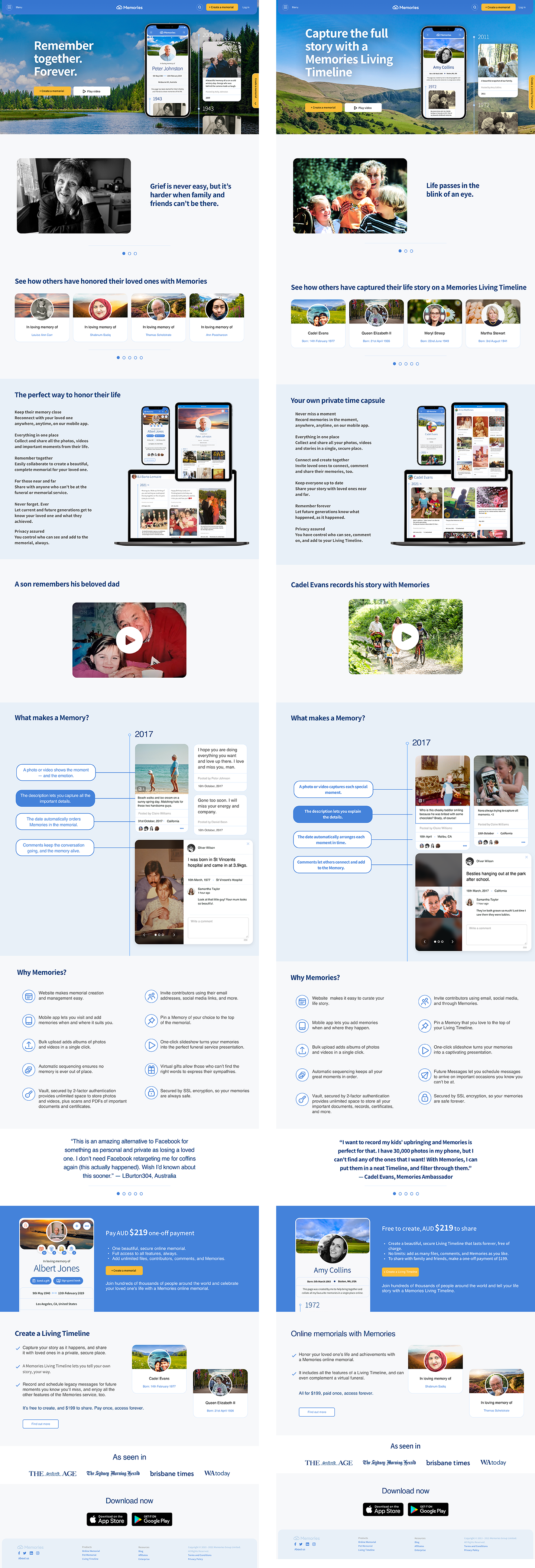
Landing pages
To reflect the changes made to the Memories platform, a redesign of the landing pages was completed. Designing this was achieved with the help of the marketing team and content writer to make sure the messaging and the flow of the story we are telling is appropriate and done efficiently. We started with a skeletal story line and an outline of all the things we want to communicate to the users. The main goals for this website design were to explain what the company is offering, what special features are available, and ultimately, get more sign ups with a low churn rate. Videos were employed, clear visuals were used and the option to sign up was available throughout the website to achieve these goals.