
The School Saving Bonus was a high-profile initiative by the Victorian Government to provide a $400 payment to every Victorian student to assist families with the cost of school activities, books, and uniforms. This project was announced by the Victorian Premier and required an end-to-end digital portal to enable families to securely apply and receive funds.
As the Senior Product Designer, I led the entire product design lifecycle—from discovery and research to design, testing, and post-launch support—under an extremely tight three-month delivery timeline. The project demanded a balance of speed, usability, and political considerations, making it one of the most challenging and rewarding experiences of my career.
The Brief
The Department of Education needed to launch a public-facing online portal to:
Enable parents and carers to easily receive and use the $400 payment.
Enable school suppliers to service parents and carers with School Saving Bonus money going into their physical and online shops.
Validate student eligibility and integrate with government and school databases.
Provide a frictionless user experience across desktop and mobile.
Meet accessibility and security standards for a government platform.
Key constraints:
Timeline: 3 months from concept to launch.
Stakeholder complexity: Multiple government departments and political stakeholders, including direct input from the Premier’s office.
Scope volatility: Frequent changes in requirements as policy details evolved.
Phase 1: Research
Despite the compressed schedule, I conducted rapid discovery sessions to ground design decisions in user needs:
Stakeholder workshops with policy makers, technical teams, and service delivery leads to define key user flows.
Heuristic analysis of existing Victorian Government portals to identify usability best practices.
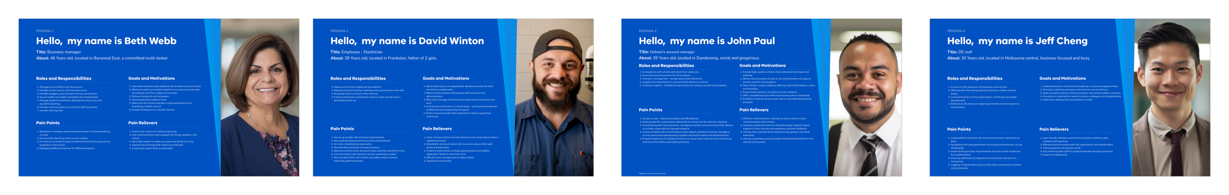
User personas representing parents and guardians from diverse cultural and digital literacy backgrounds.
The research highlighted critical insights:
Many users would access the portal on mobile devices, requiring a mobile-first design.
Users needed clear, simple instructions to build trust in a government payment scheme.
A step-by-step application process was essential to reduce anxiety and prevent form abandonment.
Phase 2: Design
I designed the end-to-end product experience, balancing speed of execution with thoughtful UX/UI principles:
Information architecture: Defined key flows for eligibility checks, application, and confirmation.
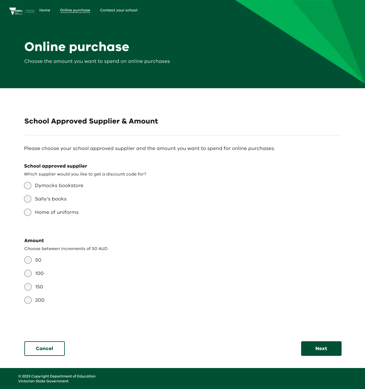
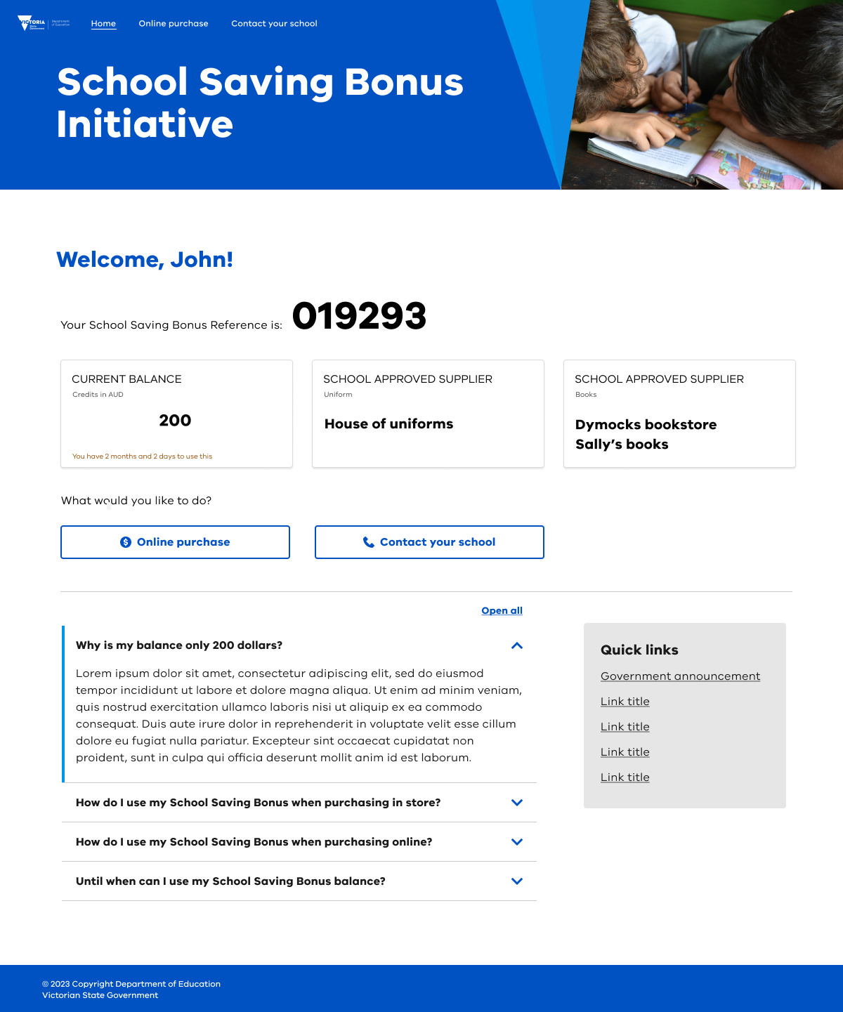
Wireframes & prototypes: Delivered low- to high-fidelity prototypes for rapid stakeholder reviews and sign-offs.
Visual design: Developed a clean, approachable interface aligned with the Victorian Government design system, ensuring accessibility (WCAG AA) and responsiveness.
Interaction design: Focused on progressive disclosure, guiding users through the process with clear instructions and visual feedback.
Email and marketing: Cross team collaboration to create content and design for email notifications and marketing collaterals.
Key challenges included:
Political input in design decisions: Requirements sometimes shifted overnight, requiring quick pivots without compromising usability.
Changing policies: Updates to eligibility criteria mid-design demanded flexible, modular design components.


Past color schemes.

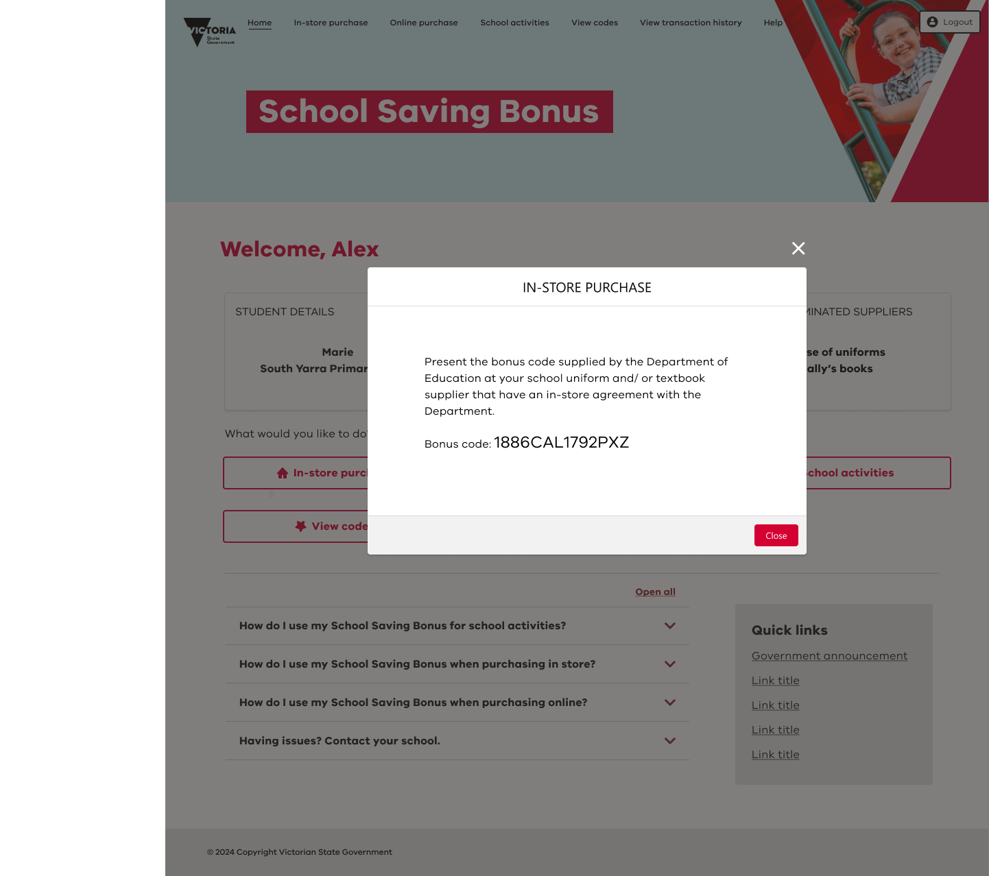
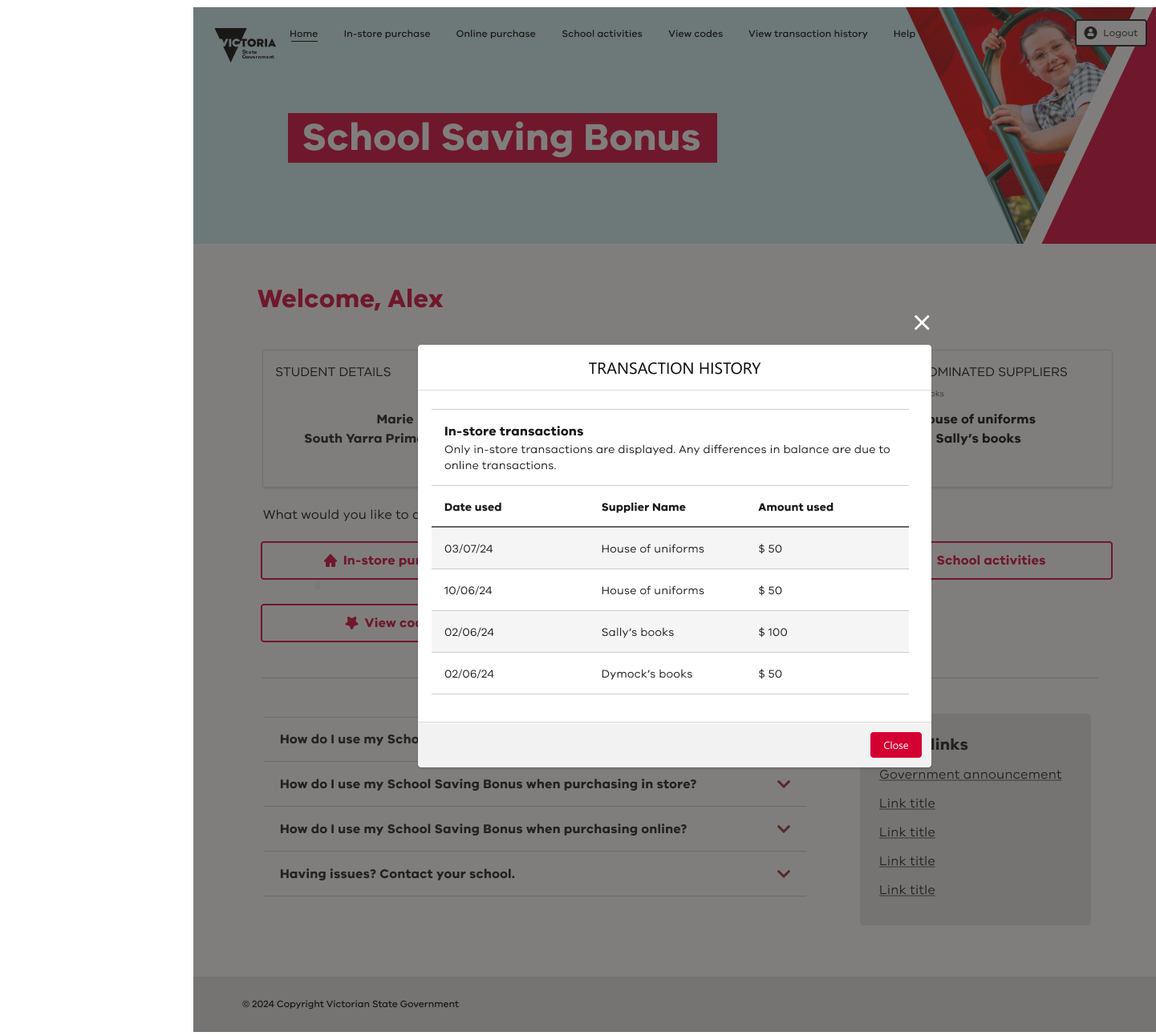
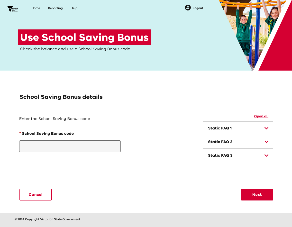
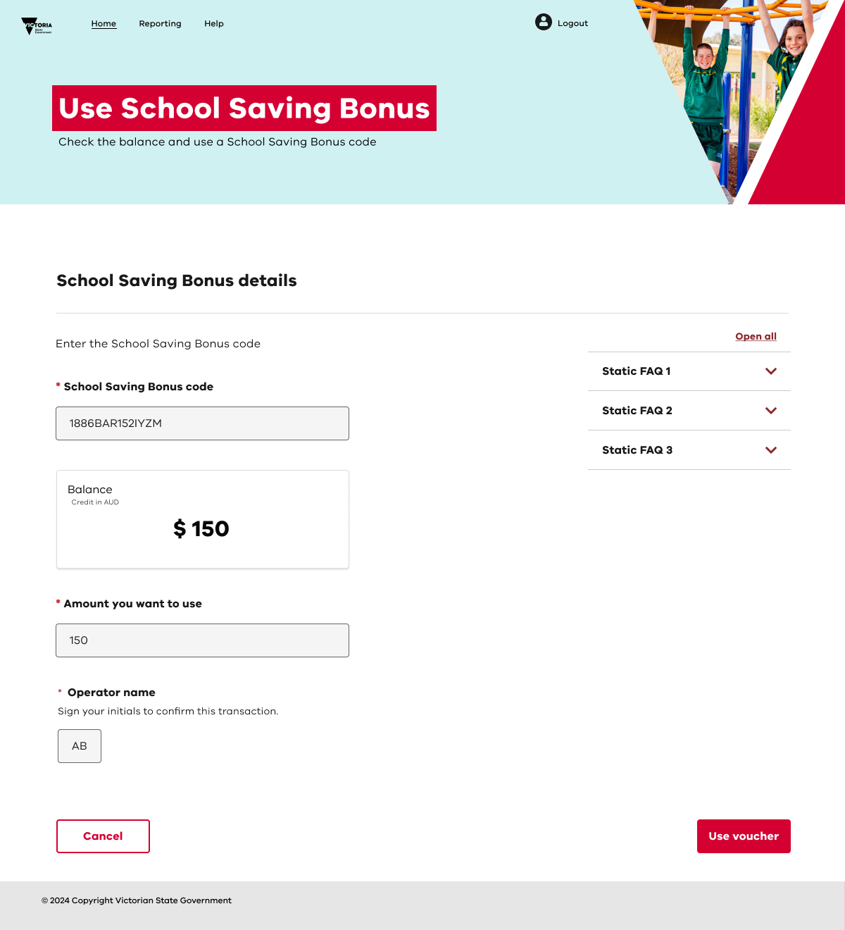


Some final designs for the parent/carer, suppliers, emails.
Phase 3: Testing
Given the tight timeframe, I led targeted usability testing and UAT to validate critical flows:
Conducted in person usability sessions with representative users to identify friction points.
Partnered with the engineering team for iterative design QA, ensuring fidelity between design and build.
Led User Acceptance Testing (UAT) to capture final feedback from internal and government stakeholders.
The testing phase confirmed that users could complete applications quickly and confidently, even under varying digital literacy levels. Given this product had an end date, there was no need to create any test plans for future testings; only information for the support team to use as reference.
Key Takeaways
This project underscored the importance of:
Agility in design: Designing with modularity allowed the product to adapt to shifting political and policy decisions without breaking key flows.
Stakeholder management: Navigating input from multiple high-profile stakeholders required clear communication and frequent alignment.
User advocacy under pressure: Maintaining a user-first perspective ensured the portal remained accessible and easy to use despite external pressures.
The successful launch of the School Saving Bonus portal demonstrated how strategic UX design can deliver high-impact government services under extreme constraints, providing tangible support to Victorian families.
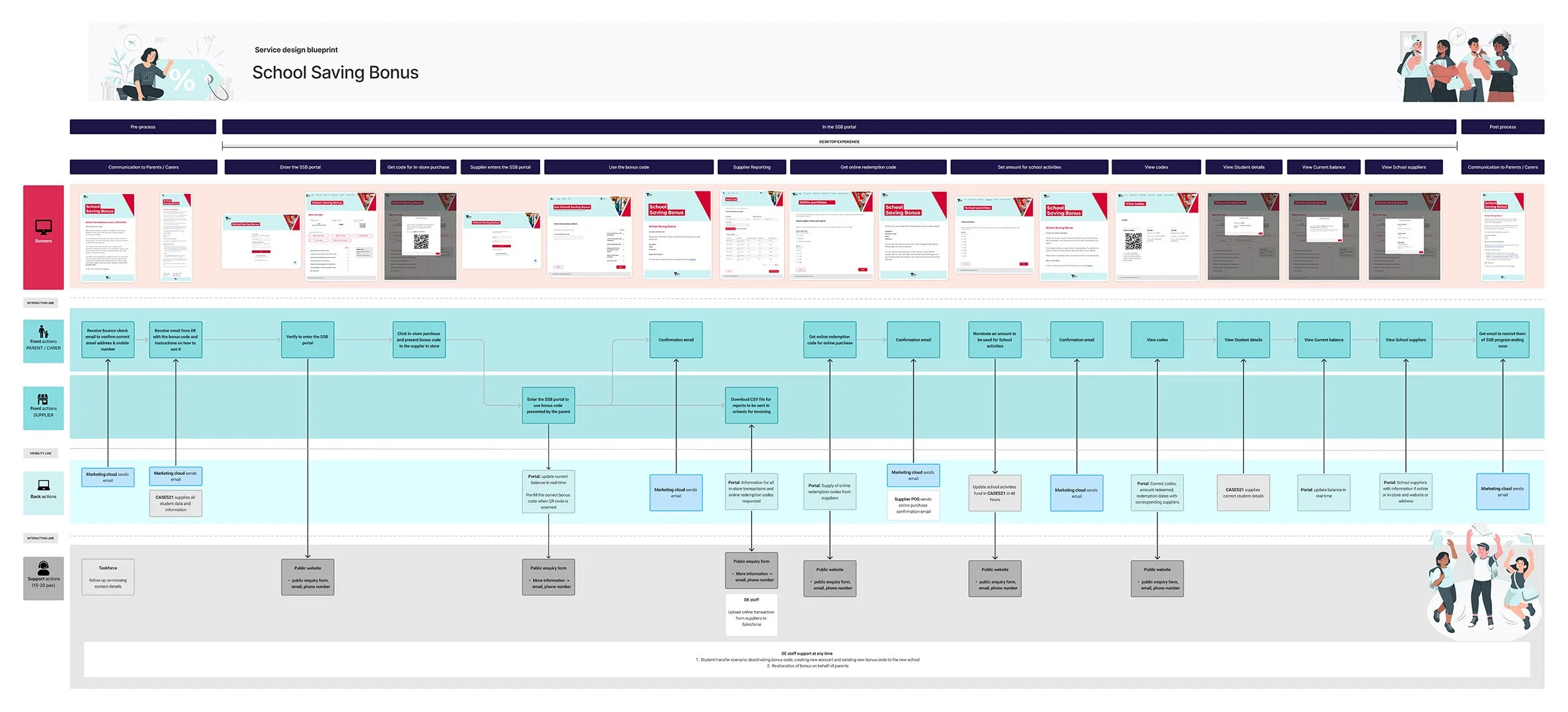
Service Design blueprint for School Saving Bonus used to explain processes and teams involved.